Color Guidelines
![]()
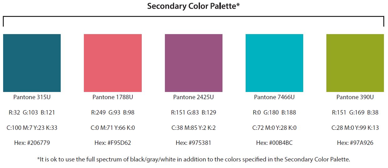
Understanding the breakdowns under each color
Pantone: A special matching system that guarantees the color gets printed exactly as it should. These are also sometimes referred to as “spot colors.” You will likely only need to use these when having materials professionally designed or printed.
RGB: A breakdown of the red, green, and blue combinations used to create a specific color. This is what should be used when creating materials that will be used on screens and monitors.
CMYK: A breakdown of the cyan, magenta, yellow, and black combinations used to create a specific color. This is what should be used when creating materials that will be printed.
Hexidecimal (Hex): A system of creating consistent colors across web browsers. You will likely use this in your web-editing software.
Saturation and Transparency
Saturation: The intensity of a color.
Transparency: How see-through a color is.
You may adjust the saturation and transparency of colors in the design of your materials, with a few restrictions:
- Saturation and transparency should not be adjusted in the Mental Health America or Mental Health America affiliate logos.
- Saturation and transparency should not be adjusted below 80%, as this makes the colors start to appear pastel and decreases contrast.
Font Guidelines
Myriad Pro
The Myriad Pro font family is what is used in the official Mental Health America and Mental Health America affiliate logos, as well as the majority of print and pdf materials MHA has designed and published.
Proxima Nova
Proxima Nova is the font that is used in some of the decorative features of Mental Health America’s website, such as the “Find MHA In Your Area” and “Join Our Mailing List” widgets.
Keep Calm Medium
Keep Calm Medium is a font that was used (along with Myriad Pro) in the design of the 2016 May is Mental Health Month materials.
Bebas Neue
Bebas Neue is a font that was used (along with Myriad Pro) in the design of the 2016 MHA Annual Conference materials.
Logos
![]()
![]()