Our brand represents our mission, values, and commitment to promoting mental wellness in our community. This page serves as a comprehensive resource for understanding and implementing our brand identity, ensuring consistency across all communications and outreach efforts. Here, you will find essential information regarding our logo usage, color palette, typography, messaging, tone, and voice. Adhering to these guidelines not only strengthens our brand presence but also enhances our ability to connect with individuals and organizations we serve.
Logo
The logo is the primary identifier of our brand. It is employed to quickly communicate our name and identity to the world.


Color
Color plays an important role in how the identity comes to life. Color amplifies brand expression and our personality.
Primary Palette: The primary palette is the core colors employed in our identity.
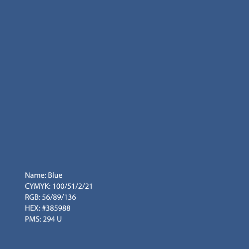
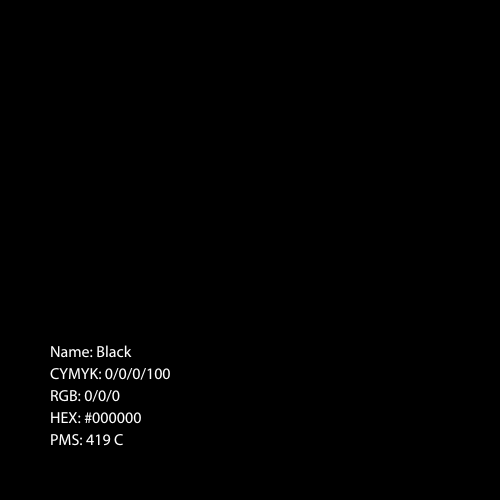
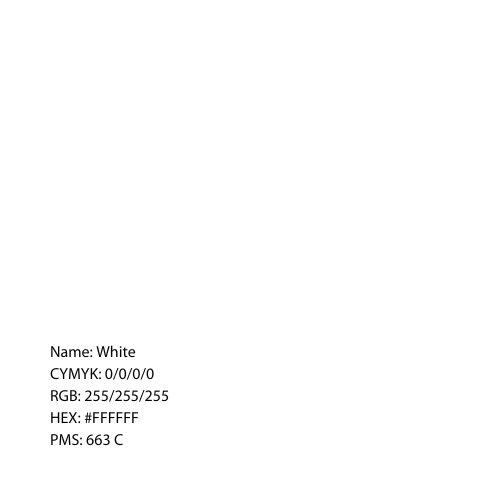
Secondary Palette: The secondary palette is the supporting colors in our identity.



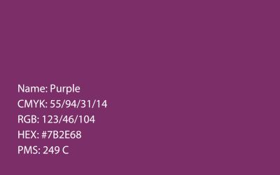

Typeface
At the heart of the identity is our unique typographic voice. Type influences the tone of language and brand expression.
Primary Typeface: Poppins is our primary typeface. Poppins Medium should be used for all headings. Other available weights include Poppins Bold, Semibold, and Regular.
Supporting Typeface: Roboto Regular should be used for body text on web and documents.
